An overview over all the different watercolour types and brands I’ve worked with, their advantages and setbacks.
Some general notes in advance. If you’re well-versed with the different features of watercolours, just skip this bit.
Quality: Watercolours come in two general distinctions: Artists’ quality (Fine Art/Künstler) or students’ quality (Akademie). All the paints I’ll be talking about here are artists’ colour quality. They’re generally more light-fast (unless noted below), and more highly pigmented. A pan of student’s quality watercolour lasts me two months. The same size pan with artists’ quality lasts me six. If you’re unsure whether you want to experiment with watercolour, by all means buy students quality. Once you’re sure you want to do more with them, and want your final products to be light-fast, go for artists’ quality.
Light-fastness: A colour that is light-fast doesn’t fade if exposed to sunlight. Some natural pigments like Crimson are less light-fast than others; they’ll fade over time. Some manufacturers of watercolours use traditional, natural pigments as well as synthetic ones that have been made for more light-fastness. If you’re going to paint just for fun, or colour comics, or any other type of illustration that is going to be reproduced, light-fastness won’t be a huge concern of yours. If your paintings are going to end up on a wall, better make sure your pigments are light-fast. More detail on each type of paint below.
Opacity: Most watercolours are more or less transparent. This means that if you paint them over an already dried glaze, or over lineart, you’ll still see what’s below. Many earth pigments are more opaque. There’s nothing good or bad about opacity or transparency. Opaquer colours result in a more solid look close to gouache or even acrylics; more transparent colours will look lighter, more feathery, and probably more watercolour-y. If you have a tendency to produce very muddy paintings, make sure you pick transparent pigments. Darker colours will look deeper in transparent paint – because they shine more, even when they’re dark. More detail on each type of paint below.
Every good watercolour pan, tube, or bottle always has information – usually in the form of little icons – on light-fastness, opacity, and sometimes staining qualities.
Different brands: For full, comprehensive and excellent information on many international paints, refer to this section of handprint.com.
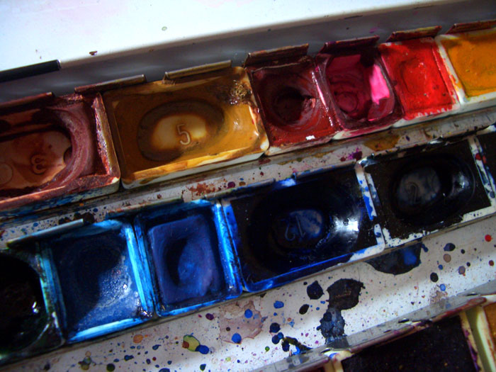
1. Pans (Schmincke)
Type: Pretty much what most people know as watercolours. Little cakes of dry paint that you wet with a brush and then paint with.
Where to get them: Artists supplies online or offline. Other good brands include but are not limited to Daniel Smith, Lukas, Daler-Rowney, Winsor&Newton, Van Gogh. My American friends recommend M Graham, but I’ve never tried those.
Result: Varies. With transparency or opacity (see below), many different looks from light to more substantial can be achieved.
Light-fastness: Varies. On the package when you buy them, there are symbols that tell you how light-fast they are. For Schmincke, it’s a number of stars (see below, too). In my experience, Schmincke paints are very light-fast (even if the number of stars says they aren’t). For example, I stared conducting a light-fastness test in the summer of 2010, and not even the Alizarin Crimson or Indigo, which are supposed to be very fugitive, have faded after being exposed to sunlight for years.
Opacity: Varies. There’s another symbol that tells you how transparent or opaque any given pigments are. For Schmincke, a black square means very opaque; a white square means very transparent. Transparent vs opaque paint can result in very difficult final paintings. On average, most Schmincke paints are more transparent than not.
Useful for: Working in small formats, especially in the open. You can take a watercolour box anywhere and have all the paints handy without unscrewing lids.
Not useful for: Painting very large areas, mixing a lot of paint.
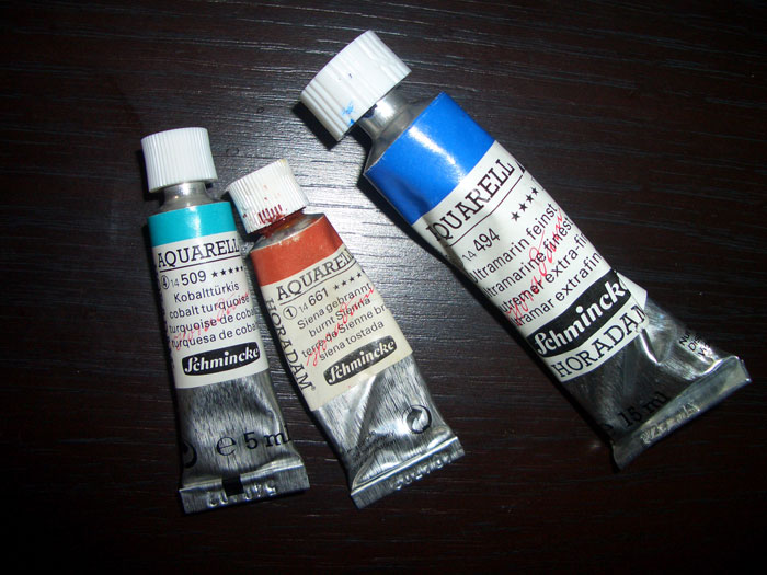
2. Tubes (Schmincke)
Type: Semi-liquid paste that you squeeze on a palette to paint with. Dried paint is infinitely reusable, just re-wet it.
Where to get them: Artists supplies online or offline. Other good brands include but are not limited to Lukas, Windsor&Newton, Van Gogh. I now use mainly Daniel Smith, Mijello, Sennelier, and Maimeri Blu.
Result: See above. Paints from tubes and pans from the same brand are otherwise identical if they have the same names.
Light-fastness: See above.
Opacity: See above.
Useful for: Working in large formats, to mix large amounts of paint at the same time. When I started to work in formats larger to A4, I switched to tubes permanently.
Not useful for: Travelling. You can still make a travelling kit with these – just squeeze some drops of paint onto a palette or into any tin or plastic box, let them dry, and you can take them anywhere.
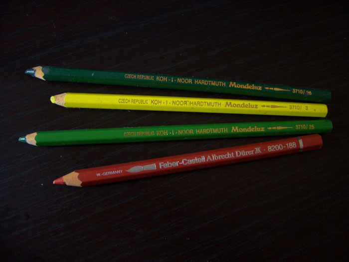
3. Watercolour pencils (Dürer, Koh-I-Noor)
Type: Coloured pencils with “pan” watercolour instead of leads. They handle a lot like normal coloured pencils, but you need less pressure; they tend to be very bright. After drawing, you go over selected areas with a wet brush to soften edges and brighten colours.
Where to get them: Artists supplies online or offline.
Result: If little water is used, similar to a coloured pencil image. If much water is used, very bright colours.
Light-fastness: Depends on the pigments used; it can be difficult to find out which exactly were used, as watercolour pencils rarely name the pigments, as opposed to good quality pan or tube manufacturers.
Opacity: More opaque than regular watercolours, and always more irregular surfaces. You can get very dark, bright colours much more easily than with tube or pan paints.
Useful for: People who prefer a drawing approach to actual painting, people who like a look of single strokes.
Not useful for: Me. ;) They’re not my cup of tea.
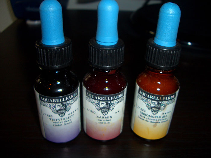
4. Rohrer & Klingner liquid watercolour
Type: Rather thick liquid in a glass bottle, with a very practical eye-dropper in the lid. Insanely highly pigmented. One drop fills an entire background. I usually place one drop onto a palette and then thin it down. These are also reusable when they’ve dried.
Where to get them: In Germany: big (!) artists stores like Boesner, or online at Gerstaecker or Boesner. I don’t know about outside Germany.
Result: Very bright colours.
Light-fastness: Varies (they’ve got these little stars too).
Opacity: Extremely opaque if used undiluted. If used with more water, almost as transparent as pan or tube watercolour (but not quite). If applied very thickly, the paint (even blue and red etc) acquires a thick and oily bronze sheen.
Useful for: Filling large areas very economically.
Not useful for: Households with cats if you forget to screw the lid back on. If one of these beauties spills over, say good-bye to anything on your workbench that is not a wipeable surface.
5. Talens Ecoline liquid watercolours
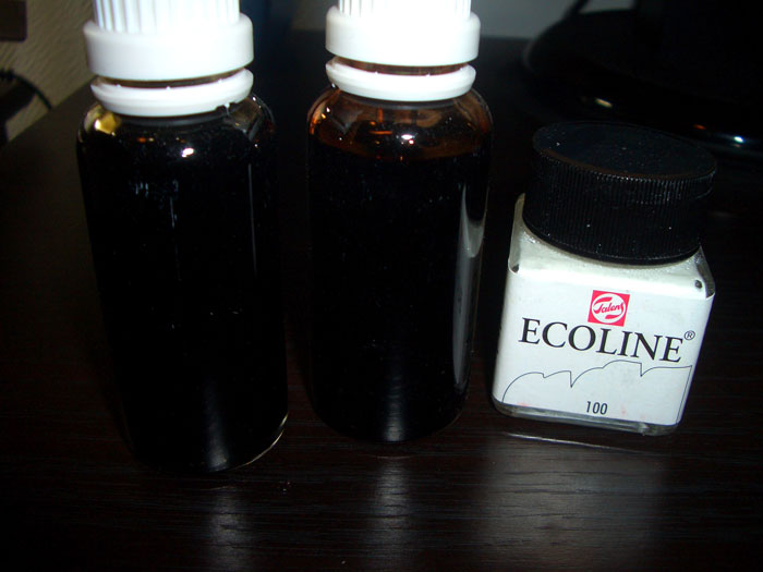
Type: Rather thin liquid in a glass bottle; no eyedropper lid, which is a severe setback. You see that I’ve filled my Ecolines into pharmacy bottles. Reusable when dried, but as opposed to the tubes and Rohrer& Klingner above, they get noticeably thinner if re-wetted.
Where to get them: I’ve only ever found these online; they seem to be pretty internationally available.
Result: Very bright, very transparent colours.
Light-fastness: Not light-fast. Don’t use if you want to put a finished painting on a wall. Fine for reproduction.
Opacity: Very transparent, incredibly bright colours. (The white up there is opaque, of course, though not as opaque as gouache.)
Useful for: Brightly coloured, transparent paintings that are done for reproduction and don’t need to be light-fast.
Not useful for: I think I addressed the light-fastness thing…
6. Dr. Ph. Martin’s HYDRUS watercolours
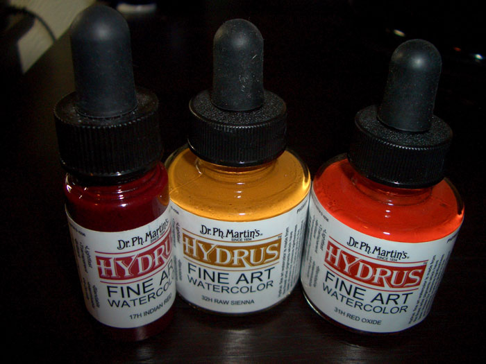
Type: Liquid in a glass bottle (or in a plastic bottle); with eyedropper lid. If you buy them, go for the glass bottles (they’re the larger ones). I’ve had some bad luck with he plastic ones – paint drying up, flaking, or evaporating. And whereas tube or pan watercolour can be re-wet and re-worked ad infinitum, once Hydrus has flaked, that was it. I haven’t had this problem with the larger glass bottles at all. They can be re-wet like any other watercolour.
Where to get them: Not in Germany. =( They’re available in the US, for example online with Dick Blick. That’s where I get mine. EDIT: They’re now available at Easy Aquarell!
Result: Very bright colours that allow darker shading than most watercolours. If applied in many layers and undiluted, becomes rather opaque.
Light-fastness: Light-fast. Says the lid. I’ve been working with them for a year and so far, I agree.
Opacity: Transparent when diluted, though ever so slightly less so than pan or tube colours. Rather opaque when used in many layers and/or undiluted. Can be used to great effect in combination with pan or tube paints.
Useful for: Anything! Easy to administer, bright colours, dark colours, you name it, they got it.
Not useful for: Like all bottled paints, travelling with them is a nuisance if you don’t have a table to work on.
That’s really something to wonder about: just today I had in mind to search for my first watercolour set ( well, the first after at least 15 years now, let’s say ), and looked frantically through your tutorials to have some clue about this matter; and, just now… You publish a post like this! Wonderful! And thank you, I will surely put it to good use, because I’m quite eager to get to colour my drawings :-)
Wow, really? That’s cool.
If you have any questions or feel you’re missing something, feel free to ask!
Thank you very much! From now, I’ve always used watercolour pans, and, for a starter, I think I will stick with it. Last time I’ve used watercolour I hadn’t even begin my School years, after all :-) however, I’ve many questions, but especially one: in what way do you project and prepare your palette for a single drawing? I think you had already a tutorials about this point, but I wasn’t able to find it… I mean, in what way do you project what kind of colour to use, the shades, and so on…? Do you have a clear picture of what do you want to achieve prior starting? Thank you!
Elisa, when I plan a painting, I usually have a fixed colour scheme in mind. Socar Myles has a great tutorial on colour and colour choices: http://www.epilogue.net/art/tech/socar_color/
In many of my paintings, I have an underlying tone that’ll set the mood for everything else, like a dirty red in “The Oath has been awakened”. In that one, I made sure that everything I painted – even the greens – got a touch of red or brown, in addition to a dirty red layer that I laid down first. That ties the whole colour scheme together. A green tinted with red in an otherwise red painting will still look green. I did the same in “There will be blood”, but with a cool blue. https://goldseven.wordpress.com/2012/04/29/there-will-be-blood-painting/ Look at how Maedhros’ hair looks cooler than in most other paintings – but it’s still warmer than any other colour in the painting.
If I work with complementary contrasts, I use very little besides the two tones that form the contrast, like in “Ossiriand”, where I have a division of reds in the foreground and greens in the background. https://goldseven.wordpress.com/2012/04/01/ossiriand-painting/ I used yellows to tie the whole thing together – yellow highlights and flowers in the green, and yellow ornaments and a strong yellow foundation in the red. Towards the back, I got colder and colder to convey atmospheric depth.
Mind you, this is my approach because I’m such a sucker for clear colour schemes! Others use their colours very differently, and that’s definitely not wrong or any less pleasing if done well. When you’re starting out, it can be a good idea to strictly limit your palette.
Thank you very much for this long and detailed reply! Hope not to have wasted too much of your time for this!
However, I’m so inexperienced in anything colouring that, really, when I stare at a palette and think about what to do with the damn thing I get definitely depressed! To have some guidelines will maybe spare me some headaches XD then, maybe, I will improve and find my way… This is the goal, no?
However, so very grateful for your time and suggestions! And – hope you feel better now, I’ve read of your flu on facebook :-(
If memory does not fail me (which may very well be), I think that you have a very complete tutorial about this topic on deviantart, too.
Not as complete as this one – I don’t differentiate between different liquid watercolours, and there are no w/c pencils.
Very informational post about the pros and cons of tubes vs pans and varying quality.
I see your well-loved pan palette in the picture, what is your preferred palette of colors, or those used most frequently?
Pretty much the one in the photo. :) Ultramarine blue, Alizarin Crimson, Burnt Sienna, Gold Ochre.
Thank you for all of your posts. I learn so much just from the step by steps and the tutorials. One day if you visit the states, you need to try Daniel Smith Watercolors. Simply lovely.
I keep hearing about Daniel Smith Watercolors. A friend bought a paper full of earth tone swatches (made from the real paint) from their website… the colors seemed so rich and gorgeous. I got jealous just looking at them… I want all the colors!!!
i used to use W&N but when those tubes run out i may switch to daniel smith. extremely vibrant. wait for a sale. i got four sheets of sample dots as they are called for $5 and then decided to invest in a few tubes (also on sale.
I’ve become curious and looked into them – and wow do they look great! AND I’ve found an online store that sells them in Germany! I’ve just ordered a few. ^^
i’m thrilled! new colors always inspire and i feel like daniel smith colors were made for middle earth :) funny thing is, my curiosity about dr. ph martin hydrus brought me back to this post. any suggestions for starter colors?? hansa yellow light intrigues me as well as raw sienna and turquoise. i’m not sure about buying a whole set and being stuck with colors i don’t want or need.
Awesome article! So informative and interesting. I’ve only ever tried tube colors with any seriousness, although I’ve dabbled in pencils a bit. It’s really neat to look at the different products and read your opinion. Maybe I’ll venture out sometime and try something new. The super-brightness of the liquid watercolors sounds very alluring…
Oh, and a note about tube colors… you can squeeze them onto a blank pallate and let them dry.I haven’t noticed any reduction in brightness or quality from doing this. So you can use tube colors like pan colors, travelling and all!
That’s true; I’ve taken that for granted ;) I just updated the article with information on re-wettability. ;)
I have just one question. What do you mean by “light fast”? I’m lost. I’ve used the Finetec Opaque Watercolor Set, there’s a transparent set as well but I don’t have that one. Have you used those? Opaque and transparent refer to color brightness? I’m new to this medium. I’m mostly a graphite artist and if I need color I go for digital and rarely, pastels.
Guess that was more that one question. :D
Light fast means how the paint will look after a year or a decade on your wall. ;)
Opacity doesn’t necessarily translate to brightness, but more to how much any given paint covers up the paint beneath it. Watercolour is usually more or less transparent, meaning that if you paint some of it over already dried paint, the lower layer will show through. The less transparent watercolour is, the less the lower layer will show through.
Oooh. Thanks for explaining.
I want to buy a very good quality watercolor pan set. I live in USA, and am considering Schminke 48 half-pan set. Is it “THE” brand of choice for watercolor in Europe? I am not keen on Winsor & Newton. Any other brand better than Schminke?
In Germany, I would say it is the paint of choice. In the US, though I would now recommend Daniel Smith – I love their quality and vibrancy; they’re really good. I would recommend any Quinacridone tones; stay away from their Primatek line with the “genuine” mineral pigments, as well as the luminescent colours if you’re just starting out. They’re toys that detract from the actual painting.
DS doesn’t make pans, but you can easily buy an empty pan set and squeeze the tube colours in there – voilá ;)
I’d recommend Permanent Alizarin Crimson, Ultramarine Blue, Cadmium Yellow Light as primary colours, plus one brown (Sepia) and maybe Indigo to start with. If you can, invest in a “dot card”. That’s a lot of little watercolour dots for you to try how they feel, but you don’t have to buy all the tubes.
And check out this discussion by pros about which colours are absolutely necessary!
Thanks for your recommendations. For now, I decided to start with a Schmincke pan set. I’ll add the Daniel Smith dot set to complement it. After that, I’ll experiment with adding some of the other media you have written about in this blog.
Wow! So many types! I have mainly tubes but in art class I use pans which I really love! I wish I had all of these at an unlimited supply to simply dabble! :)
I don’t plan on getting all types of paint right away. Now that I have done my research, I know the order in which I plan to proceed :)
I will primarily be a pan person – that’s how I grew up loving painting. Also, there are times in my life that I have not painted – so, tubes don’t appeal to me as they can dry up. I cannot think of wasting expensive paint.
Hi! I heard about St. Petersburg’s white nights watercolor, but I really don’t know anything about them. Someone said me that are the best watercolors (best than W&N and so) anyone knows them??
I’ve tried them, and while they may be better than Windsor&Newton (which I don’t like too much in the first place), they’re no match for Schmincke or Daniel Smith, in my opinion.
Hello
Sorry my piece is coming two years late but i’d really love a bit of your advice with regards ecoline and traditional watercolors.
I was wondering, as you said ecoline paints rent lightfast. So what if I intermix the ecoline paints with say..a Windsor and Newton tube color for a professional artpiece.
Would the painting still stand the test of time or its a no-no?
Meanwhile, you’ve done quite a pretty nice job with your article.
Two thumbs up!
Akan.
Hi Akan, you can always intermix, but the result probably wouldn’t be as lightfast as other paints. For example, if you mixed a lightfast yellow with an ecoline blue to get green, chances are you would be left with the yellow after ten years or so.
The thing is – of course you *can* use it. You can even sell originals painted with it. But make sure to tell clients, and advise them to get a UV-proof frame for the piece, and hang it well away from direct (or even indirect) sunlight! ;)