A Light in Dark Places (and good riddance to 2018)

“May it be a light to you in dark places, when all other lights go out.”
Watercolour on Stonehenge Legion cold-pressed paper, 22×36 cm.

Prints available on Etsy!

Walkthrough with a lot of art tips on Patreon.

It has taken me a while, but I finally begin to feel that I’ve got the ground back under my feet. Just knowing that, in another day or so, this year will be over is surprisingly liberating. There is a lot that 2018 left me and that I will continue to deal with, but it feels immensely gratifying to say, sod off, 2018, you’re history. I’ll deal with stuff, but those horrible months are never, ever coming back.

I finally feel up to saying how grateful I am for my friends, online and offline, who have helped me through these dark months, and whose faith in me has wavered far, far less than my own. I finally feel that maybe it may have been appropriate. All of you who have continued to support me in 2018, in word and deed, THANK YOU! Have a wonderful 2019. We’ve all earned it.

Roast rabbit – and an art revelation

I had a clear “where have you been all my life” moment yesterday. After using gouache quite satisfactorily on Gil-galad, not just for highlights but also for some rendering, I decided it was time for another stab at gouache.

Gouache is often described as opaque watercolour (and indeed, many languages use no separate word for it), and can either be applied thickly and even paste-like, much like oils, or in thinner washes, much like watercolour. I’d often thought about trying around with the former, mainly because I’d been using only the most transparent of watercolours in recent years and felt that going opaque was just the opposite of what I wanted. One and a half years ago, roughly, I bought a book on painting animals in gouache, and faithfully copied the examples. It worked, but I didn’t like it. My gouache tubes went to the bottom of my art cupboard again.

I’d been thinking about the medium again and wanted to take another shot at it, when I looked at some paintings in my “inspiration” folder whose technique had always baffled me and it hit me: They weren’t watercolours. They were thinly glazed gouache paintings.

Gouache has a pastelly, fuzzy quality to it that I’d never really given much thought.

I immediately decided to try that. My mother had asked for a picture of Sam Gamgee roasting a rabbit, and it looked like just the thing to try in gouache.

I painted very much the way I always do, except that I mixed in white instead of relying on the white of the paper. The white gouache made for a fuzziness that just turned blending colours into an absolute dream. The greenery in the background also just fell onto the paper effortlessly. The only thing I’ll do differently next time is that, instead of a thin blue shadow map, I’ll do a bolder, more neutral shadow line the last time, and drop in the blues later, while it’s still wet.

rabbit_col

I recorded the painting process and uploaded it as a timelapse here.

The original painting is available in my Etsy shop!

rabbit_framed

Tutorial: Painting with Acrylic Inks

c_laerminuial_col

The latest huge new discovery of 2013 were acrylic inks (used to paint “Fog over Trasimene“). They’re quite similar to watercolours in many ways, but more versatile. They come in little bottles with eyedropper lids, just like the liquid watercolours I love to work with.

I’m working with three different brands here: FW Daler/Rowney Acrylic Artists Ink; Rohrer/Klingner Zeichentusche (drawing ink); and Liquitex Ink. The handling is almost identical to watercolours: I use them with my normal watercolour brushes, thinned down with water or undiluted. No changes there.

All the brands I use come in different opacity levels: from transparent like actual watercolours to opaque, and in this case, opaque is really opaque. I work with a selection of mainly transparent ones, to preserve my watercolour look, but have a few opaque ones, mainly light tones like white, for highlights. In order to keep them apart, I used small blue self-adhesive dots to paste on the opaque ones, so I don’t accidentally grab the wrong bottle. Like watercolours, different pigments have different lightfastness ratings. I’ve made sure only to buy lightfast paints. tut_acr1 The other huge difference is: when acrylic dries, it’s completely insoluble. When you add layers in watercolour, you will always slightly dissolve bottom layers. In acrylics, you can use completely transparent layers that leave all the detail work in place underneath. Whether you add dark shadows or light fog – I did both in the “Trasimene” pic linked above – it opens a world of opportunities.

With watercolour, you have to work from light to dark, for several reasons. You can’t paint light skin next to black hair; the black hair will run into your light skin. And you can’t add light colours atop dark ones. In acrylic, you have no limitations. You can put dark hair down and later add a light yellow across the whole image – nothing will run. You can add light highlights to dark areas – just use opaque paint.

The downside of that is: your palette. With watercolours, you can reuse, rewet, and clean palettes without problems. Liquid acrylics are pretty much there to stay. With tube acrylics, that’s bad enough; with liquid ones, you have the additional problem that you need a palette with small “pots”. My solution is a lucky one – in Germany, we have outrageously yummy sweets called “Toffifee”, which come in little blister packs. They’re perfect for liquid acrylic palettes. When I’ve completely mucked them up, I can just throw them away. So now I have a great excuse to keep buying Toffifees. Yay.

The picture is a commission for the wonderful Paul, for whom I’ve already done “A Sorrowful Meeting“. It’s his character Laerminuial, a Noldo jewel smith from Rivendell.

c_laerminiual_ln

I haven’t arrived at the definitive paper for acrylic inks yet. I’ve tried around with Canson Montval and Schoellershammer – Montval tends to cake ever so slightly, but Schoellershammer has some really unfortunate speckling qualities, so Montval it is. Generally, I’m still working with watercolour papers, as I still want the overall feel to be more watercolour than acrylic.

In the photo below, the first light yellow wash is already in place.

tut_acr2

I had one huge “PANIC!” moment connected to liquid acrylics: They speckle when wet. Dramatically. Most dramatically: Rohrer/Klingner Antique Gold Green.

tut_acr3

When this happened for the first time – in the face, of all places – I did panic, and ripped up the whole thing. Later, after the ripped-up painting had sufficiently dried in the dustbin, I saw that the face was perfectly smooth again. And that even works with Rohrer/Klingner Antique Gold Green.

Lesson learned.

When the background wash had dried, I applied some basic wet-into-wet washes for the columns and shrubs, allowing the colours to mix on the paper. I did the skin in the same soft rosy wash.

This works pretty much like watercolour. Overall, the following steps all mimic my usual watercolour techniques.

tut_acr4

I then proceeded to put down the basic colours for the dress and hair. For the dress, I worked around the ornaments the way I usually do – I can always go darker later, or lighter, to pull everything together. Right now, I just wanted to have the basic colours down. And watercolourist that I am, I still feel that leaving something light looks better than painting it light. :D

tut_acr5

Now comes one of the wonders of ink.

In order to give a colour to the ornaments on her dress, I can just lay a wash over the whole thing. I can tint, I can darken – all in transparent ink; the paint underneath is left untouched and crisp. If I tried the same thing in watercolour, the layer underneath would blur.

tut_acr6

More detailing to the shrubs, skin, lamp, and dress.

tut_acr7

Below: More detailing (lamps, shrubs), deepening of shadows (background, columns, shrubs, dress) and tinting. Tinting is one of the greatest assets of acrylic ink. If a colour isn’t as you want it – add a wash of what you want. Acrylic ink, like watercolour, lightens as it dries, and also “deadens” a little. Overall, that’s like an inbuilt safety net, with unlimited correction possibilities, as you can always just add another layer as you find you need them. You can see I work in a sort of island hopping approach – deepening shadows in different areas of the painting as I feel necessary, to keep the overall thing coherent.

tut_acr8+9+10

Lastly, a bit of more detail work – the leaves, and some highlights on the figure.

tut_acr11

Crossing the Alps

Across the wild alps

Across the wild alps

This piece really gave me a hard time, but it’s probably very fitting that, in mid-October, I struggle with a piece depicting Hannibal struggling with the Alps in mid-October. My losses were in paper and pencils rather than mules and men, but it seems crossing the Alps isn’t meant to be easy.

The lineart stage alone took me a week and four pieces of paper as I redrew this bit and that and put the pieces back together again. The colour was even tougher. I don’t think I’ve ever painted anything as complex as this. I’d say I mostly succeeded. Another parallel there.

Before I started, I made myself a greyscale sketch in Photoshop, so I knew where to get how dark in the final piece.

 wp_alpen2_colwip

Then I mixed some Phtalo Blue, Indigo and Shadow Violet in one compartment of my palette, some Ochre in another, and then some reddish brown from leftovers I had in my palette (probably mainly Burnt Sienna, Piemontite Red, and Sepia).  I sprayed my entire canvas with water and added a very light blue wash, then going into all the bits that are exposed to the light with extremely thin Ochre.

Then, when this had dried, I painte a rather uniform pale blue sky. The picture is going to be busy enough; when everything else is done, I’ll decide how many clouds this piece can handle.

tut_alpen_02

Next, I started painting the mountains in the back of the image. I used a pale Blue, mainly Phtalo, and painted the “negative space” around the snow. I mixed in some green to suggest a few trees further away.

tut_alpen_03

Then I went about detailing the rock-faces closer to us, with mixes of different blues (more Pthalo here, more Indigo and Shadow Violet there), intermingled in the shadows and rockier parts with different, toned-down browns I mixed above.

tut_alpen_04

I make sure never to get too dark, but more and more detailed towards the front.

tut_alpen_05

More details and deeper shadows to the rocky bits.

tut_alpen_06

I painted a thin brownish/bluish wash across the army and the space below them, to tie them in with the surroundings. The group of three men, immediately behind Hannibal and the soldier he’s pulling to his feet, is overlaid with a muddy wash so they won’t distract from the two later on.

tut_alpen_07

I then decided the empty triangle of sky could well use another mountain, plus a few bluer shadows on the other mountains, which I painted in with Phtalo and Indigo.

tut_alpen_08

Next, I set out to paint the mountainside to the left. It’s completely in shadow, and I mixed some more reddish tones into the blue.

Down there, you can already see me detailing out the rocks with a brownish wash. The colour consists of everything I have on my palette at this point. 
tut_alpen_09

Finished detailing. Not too much – I want the detail to be almost lost in the rock face later on, enough to look finished and non-monotonous, but nothing to distract from the figures.

tut_alpen_10

Next, some skin, bronze and leather.

tut_alpen_11

Outfitting Hannibal’s Libyans with warm winter clothes. Quiet there in the back, I’ll get to you eventually. The elephants go first.

tut_alpen_12

More detailing of the figures in back. Simultaneously, I determined how dark my darkest spots would be in this image – Hannibal’s hair – to set off the rest against it, and to have something to check the column against, to keep myself from getting too dark in the background.

And well, after fiddling with hundreds of little figures for hours that don’t look like anything, I needed something rewarding to paint.

tut_alpen_13

In this painting, my approach is very un-classical. Instead of going strictly from light to dark, I made sure to lay done some guidelines, shapes through the painting, forcing myself to keep an overview rather than getting lost in the details.

Like the fact that Hannibal’s sword is four inches long. >_<

So this is where the mixed media part comes in, and I mixed some dark burgundy with gouache and fixed that sword thing. Next, I added some bright colours (not gouache this time, still sticking mainly to the colours I’ve previously used) for Hannibal’s clothes. They’re too bright as of now, but I plan to make generous use of dark shadows and liquid watercolours to tone them down and add that extra punch that liquid watercolours excel at.

The shields of the men in the back have also been detailed with a mix of ochre/Burnt Sienna/violet mixes already in use. No new colours have been introduced here.

I also painted over the entire army in the back again with a good brushful of dirty water. That got rid of the little white flashes of unpainted whites everywhere, and tied them together neatly. I’ll go in later to pick out some bronze helmet highlights.

tut_alpen_15

Liquid watercolours in action, picking out shadows.
tut_alpen_16

Some gouache too, for lighter highlights, which I rarely do, but which are needed here.

The colours look off in the photograph; the original looks much better.

As gouache palettes, I always keep the plastic lids of Chipsletten crisps (Pringles-like,but Chipsletten taste better). They’re the perfect size and quality for palettes on an overcrowded desk like mine.

tut_alpen_17

The epiphany of the week came with the realisation that a watercolour that looks off is ruined, and a gouache painting that looks of may just not be done yet. That’s a concept I never really grasped. The next step will be to understand how to go on. I manage well enough with gouache in metal and clothes, but skin is not very successful yet. A part of me refuses to paint skin with anything opaque, which seems to be my problem.

Last details of the Celt’s helmet…

tut_alpen_18

And the clothes of the men in front.

tut_alpen_19

Gandalf walkthrough

wp_gandalf_col

My first step, as usual, is a pale wash over the entire canvas – here, a cool blue. I brush it off with a dry, clean brush over the mountaintops, the smoke, Gandalf’s beard and face where the light hits.

tut_gan01

Then I start painting the face. When everything around it is still so light, the reddish tones around eyes and nose often look totally overdone, but in the end, when everything else is painted as well, it’s hardly noticeable any more, so I often end up darkening it again after all.

tut_gan02

I paint the robe and hat with a mix of Prussian Blue and Shadow Violet, my favourite granulating colour, which results in nice, rough effects here.tut_gan03

Next, some subtle and well-placed darker shades on the mountains.tut_gan04

The blue scarf…. and look how pale that face suddenly seems again.tut_gan05

Let’s have some more red. He looks drunk? Not for long. In the end, it’ll be just right.

tut_gan06

Shading on the fine tips of hair and beard.

tut_gan07

Shading and texturing on the scarf and cloak. I’ve brought out the eyebrows with a bit of gouache.

tut_gan08

Texturing wood works best painting around the highlights of the wooden structure, and deepening the shades in and around the knotholes.

tut_gan09

A sorrowful meeting

wp_daughtersfolly_2col

Sorrowful was their meeting in Tasarinan; for Finrod was lost and Angrod too, and never more would Aegnor walk beside Andreth Saelind beneath the green leaves of spring.  ~(Paul Leone, the commissioner of this piece)

You’ll remember this one of Finarfin being reunited with his daughter Galadriel around the War of Wrath. I redid it as a commission – as you know, the old version was coffee, and it wouldn’t be a good idea to hang it on a wall! :)

On my latest workshop, so many people were doing terrific things with masking fluid, so that I decided to give that another go as well. I used it for a layered look of negative space throughout; here you can see how:

tut_galad

Workshop Aachen – we put the water in watercolour! (Mainly from above.)

And another weekend with great fun, fantastic creativity, and abysmal weather. Aachen really puts the water back in watercolour. Thanks to all who braved the rain and storm (and bad lighting!) to join us!

Kirsten was again so kind to film some painting demos; I’ll upload the vids when I have them! Until then, here’s a skin-and-hair-and-beard demo of Thorin Oakenshield, and a painting armour demo (hail damage insurance from Knights Weekly).

wp_thorin2wp_armour

And well, some Hannibal had to join us. As a matter of fact, we saw even more of them – two other participants drew Hannibals too, though one was the Lector subspecies. :D wp_age-chart_col

I’ll soon update my deivantArt journal with all the artwork created there!

The Darkening of Valinor

This is a commission I took on last November (…!), for a wonderful guy and one of the greatest clients I’ve ever worked with. He wanted a painting of FĂ«anor holding his slain father, and the scene quickly evolved from there.

As usual, the fist sketches I made were digital, so I could shift around elements and try out what looked good where – digital thumbnailing. In the margin, quite a lot changed; the centre was pretty clear for me right from the start. Only FĂ«anor’s head went all over the pace during the sketching phase.

wp_finwe

wp_finwe2

At this stage, I took it to pencil and paper, lightly sketching out Fëanor and Finwë.

finwe_ln_headraised

In the end, I had everything where I wanted it (and had corrected FĂ«anor’s leg and FinwĂ«’s head wound). For the centre image, I had been working in A4 format, which I find easiest to handle. (Especially on a desk otherwise overflowing with unmarked exams – school really kept me away from drawing for the better part of 2013. But you probably noticed that from the absence of pictures this year.)

wp_finwe_ln_final

I then started on the background. For this, I printed out the centre piece on an A3 sheet of drawing board, in light orange, so I could filter it out digitally later and put the two different elements together but was in less danger of smudging anything. I wanted the centre piece there with me, because the entire piece was to have a unity (FĂ«anor was to be in direct eye contact with Morgoth across the different picture elements, and later, I continued certain flow lines across the borders- such as FĂ«anor’s clothing continued in ManwĂ«’s clothing behind Nienna).

wp_finwe_wip2

Drawing Morgoth.
wp_finwe_wip3

Outlining the Valar. Ungoliant would be redrawn completely – she looks absolutely wonderfully terrifying, but I assembled her wrong – the legs are attached between the head and the main body of a spider, not on the main body. I can’t believe I studied spider anatomy for this image, and actually desensitised myself (huge arachnophobic here) enough to be able to google wolf spiders and draw them as terrifyingly as I could make it. Incidentally, the desensitising effect was enough for me to clean the basement floor for the first time since we moved into this house. If I’m feeling particularly daring, I might scrounge up the courage to pack up the spider-infested tent that has been lying around in the laundry room since last September.

Apart from arachnophobic concerns, another huge topic was how to portray the Valar. I’m really glad that the client gave me completely free reign with this. I had a hard time finding back to my view of some of them – I’ve seen entirely too many Morgoths, Mandoses and ManwĂ«s looking entirely too pretty. Many will disagree with me for ManwĂ«, and feel free to, by all means – I know that “they took the forms of the children of IlĂşvatar”. And yet, Tulkas has a beard, and when I first read the Silmarillion, I imagined the Valar like Greek or Norse Gods, with ManwĂ« definitely in the tradition of Odin and Zeus.

wp_finwe_lineart

Fun fact: Nienna, for me, has always looked like the woman in the video of “Babe” from Take That. The song was in the charts in 1993, while I was reading the Silmarillion excessively during my last year at school, and the video featured a solder coming home from a war (?) in a wintry landscape, where a woman clothed head to toe in some sort of black gauze was walking through the ruins of a Russian palace covered in snow, usually with her head in her hands. I’d never been much of a Take That fan (my teenage tastes were rather unusual – Maedhros, Hannibal and football players instead of Mark Owen and Gary Barlow), but the video fascinated me visually. And gave me a clear vision of Nienna.


Next up: Watercolours!

Fingon and Aredhel – mixed media experiment

I doodled a very nice Fingon and Aredhel into my sketchbook yesterday – with coloured pencil, which yielded some really charming results. I decided to try watercolour on top of those – only to realise that my coloured pencils were water soluble.

wp_brother-sister

So I printed the sketches out on watercolour paper again, and got to work, spraying the entire paper with water and then laying down a Quinachridone Gold wash.

tut_fa_1

A bit of flesh-tint with Burnt Sienna and Madder Red.

tut_fa_2

Some Ultramarine for the shadows.

tut_fa_3

More reddish and bluish tints. I really like this effect. Maybe next time I try this technique, I won’t do it on a character with dark hair.

tut_fa_4

Painting the hair with Ultramarine, Madder, and rather a lot of Shadow Violet.

tut_fa_5

Some final touches with paint, and later some more with Polychromos and white gel pen.


Finished:

wp_aredhel2_col


wp_fingon2_col


The harp no longer sings

wp_harp_col

This is a concept that has occupied me for years, resulting in several pieces already. It’s symbolic rather than illustrative of any given passage in the text – Maglor, a remnant of the Elves in Middle-earth but excluded from his people, caught in a world of his own where music no longer brings consolation, surrounded by the ruins of the former greatness of the Noldor, whose downfall he had a part in.

I’ve never really done much with the “ruins” part of the scenario; half-hearted attempts at best, probably because I really struggle with architecture of any kind. Now, though, I’ve decided to give it another go.

This is a more refined version of the first sketch.

wp_harp3

Here’s the lineart:

wp_harp_ln

When I print the lineart, I tint the ruins in the background more greenish and very light, so that it will mostly disappear in the finished painting, and reduce the ruins to faint structures that could just as well be from a dream.

tut_harp1

This picture is a great excuse to make excessive use of my new Cobalt Turquoise from Schmincke. For the first background wash, I mix it with Chrome Oxide Green and a touch of Ultramarine and Cadmium Yellow, and apply it very thinly with a soft brush, lighter at the top and darker at the bottom.

tut_harp2

I then re-wet everything, and paint darker streaks, that will look like sunlight filtering through tress – or through water. I want the whole lighting here very ambiguous.

tut_harp3

After this has dried, I use the same colours – more green here, more blue there – very thinly to paint the detail in the ruins.

tut_harp4

To make it less monochromatic, I go in with a bluer tone, and paint the shadows in the areas between the streaks of sunlight. This is the point where my camera decides “This is all just green. Yeah, whatever.” I hope my scanner is more sensitive later…

tut_harp5

In all the following, excuse the turquoise colour mash, please.

Next, I add some Ochre to everything in the foreground – first the structures, to suggest sandstone or a similar stone.

tut_harp6

It gets a greenish-blue layer for shadows, to make it stand out less. I then decide Ochre will make a great foundation for the figure too. This looks very yellow now, but will mostly vanish under the greens and blues of Maglor’s clothing later, only serve as a “grounding” in the light situation around him.

tut_harp7

Some detailing in the ground – mainly with Ultramarine and duller Indigo, but with the brush dipped into Chromoxide Green, Cobalt Turquoise, and Ochre here and there for colour variation.

tut_harp8

Detailing on the leaves, again with the whole range of greens and blues used above.

tut_harp9

The skin is done with Burnt Sienna, as usual, but thinned down beyond recognition with my dirty water, which is now a nice green-blue concoction, rather thick too, as it’s dried overnight. Comes in extremely useful for making any colour fit the mood of my painting.

tut_harp10

I use the same principle with the hair tone, which is Sepia with a lot of dirty green water. The shadows are done with a touch of Indigo, too.

(Give my camera a kick here, please. Thanks.)

On the image on the right below, I’ve re-drawn the eyes and brows slightly with a Sepia marker, as the lineart was starting to dull under the paint.

tut_harp11

Below left: Next, I put in the base tones, very light, of Maglor’s clothes. I choose a mix of Cobalt Turquoise, Ultramarine, and Chromoxide Green for his tunic, and a more Indigo-heavy tone for the cloak. The hose is just my dirty water at this point. ;)

Below right: First layer of rendering. I build the shadows up slowly, mostly with Indigo, to avoid getting too dark too soon, and adding another layer here and there to add depth.

tut_harp12

Below: detailing on the arm guards. (I love doing Maglor’s arm guards.)

tut_harp13

After darkening and shading, and detailing, we arrive at this.

tut_harp13a

Final touches include painting the falling petals with white gouache.

tut_harp14

The Oath has been awakened – painting

wp_seven-sons_ln

In painting this one, I was facing the challenge to have a lot of reds, even in the sky, and horses – which sometimes leads to dangerously girly-calendary motifs.

So far, I seem to have succeeded in not falling over on that side of the fence. I know that because my daughter, a great fan of horses and pink, keeps looking at the picture on my desk and walking away without saying a word. That’s her way of saying, “Really, mum, such lovely horseys, and such ugly colours. I’d tell you so but I’m afraid of hurting your feelings.”

Yay!

Note: The colours on the photographs deviate really far from the actual ones at times. When I used the flash, they’re too yellow; when I didn’t, my daylight lamp resulted in too bluish tones. The entire pic is too large to be properly photographed with the means I have.

The lineart is, again, pencil, scanned, tinted and photocopied onto watercolour paper. See here if you have any questions.

My daughter would have loved the first stage. I overlaid the whole pic with a warm light red wash composed of Madder red and Ochre, dabbing some paint off the horses and figures, particularly the upper parts, allowing all those twenty-eight horse legs to blend into the rest.

tut_seven1

Then, I added streaks of more red into the sky, and blotches of Chromoxide Green, Madder red mixed with Ultramarine, and Burnt Sienna into the ground, for the colours of heather.

tut_seven2

Next, some Ochre, Sepia, but my violet mix from above for the stones. Later, they’ll be lighter than the rest.

tut_seven3

Next, I proceed to paint more heather. I mix more Madder Red with Ultramarine, and paint the upper edges of patches of heather…

tut_seven4

While the paint is still wet, I rinse my brush in the orange-y dirty water in my water container, and drag the paint down with it. The jagged top edge remains unaffected, the rest…

tut_seven5

… is blurred and diluted.

tut_seven6

Patches of heather:

tut_seven7

I proceed to muddy the sky (and frustrate my daughter), and add a dirty wash of Burnt Sienna and Ochre to the top margin of the painting, drawing it down with more dirty water.

tut_seven8

The ground now gets a second wash of my violet mix with Burnt Sienna, darkening it and softening the edges of heather.

tut_seven9

I allow it to bleed into the horses’ legs, to merge them with the ground. A while ago, I used to cleanly separate every element of the image, and sometimes, that would result in cut-and-paste looking picture elements.

tut_seven10

This is a sort of middle stage, from which I can start to add layers. It’s also the sort of stage that’s already starting to look good, and which I can safely leave on my desk without cringing whenever I walk past it…

tut_seven11

After a good night’s sleep, I decide that the ground is too light, and add another darker layer, effectively killing my detailed heather. Which isn’t so bad. It’s still there in a blurry way, and will look very organic when I’m done.

tut_seven12

Now, for the sky. I rewet the upper portion of the picture, mix some dramatic dark violet (with Madder Red, Ultramarine, Indigo, Sepia, and Burnt Sienna) and paint streaks into the wet areas, allowing them to run.

tut_seven13

The ground is dry at this point, and I start to paint the orange shrubbery around the stones. For this, I use gouache – watercolour wouldn’t have been visible. I also redo my heather in the same way I did above.

tut_seven14

I then add some highlights, again with gouache, to the shrubs and stones, and paint a few stray patches of wild wheat.

tut_Seven16

Then I go as daring as I get and use green to paint the sallow thorn and the far hills, adding a few berries into the branches.

tut_seven17

Now, finally, the figures. I start with some reds and ochres to see how it looks. Yup – looks good!

tut_seven18

I paint the figures and horses with a fair deal of island hopping, working on whatever spot begs my attention (and is dry), mostly sticking to one colour at a time, more or less.

tut_seven19

More detailing.

tut_seven20

Just to show you how small some of the bits and pieces here are… The entire piece is 65 x 32 cm. … That’s one cent, btw.

tut_seven21

Some final touches with white gouache to spearpoints, hair, fur.

tut_seven22

Finished piece and detail shots: https://goldseven.wordpress.com/2013/02/13/the-oath-has-been-awakened/

Eärendil the Mariner

wp_earendil_col

“Hail Eärendil brightest of angels,

over Middle-earth sent unto Men!”


Eärendil was arguably the first figure in Tolkien’s legendarium that he ever devised and gave a story to. In the designs, I went for rather archaic Germanic and Anglo-Saxon elements, some found in an edition of the Edda I own, which is over a hundred years old and belonged to my grandparents. I like to think Tolkien knew it.

Germanic lore, with its brisk heroism, has always fascinated me. Tolkien wrote once in a letter that something he hated Hitler for was for taking those old Germanic myths, sagas and lore and twisting them into his sick ideology, and even sixty years after Tolkien wrote those words, they’re even more painfully true. I own several beautifully illustrated Eddas, and the pictorial “language” in all of them just says “Nazi” to most people, which is so, so sad.

So this is something else to love Tolkien for: For rescuing those old Germanic myths and sagas in a different incarnation.

Media used: Schmincke tube watercolours for the first transparent layers; liquid watercolours from Rohrer&Klingner for the dark ones, and some white Ecoline Talens ink for some of the highlights and the clouds, all on Canson Montval paper.

Not many progress shots for this one; just a couple of ones documenting the “underpainting” and lighting. I built this up of considerably more layers than I often do, and used wet into wet, which I do even less often.

This one was a first layer of blotchy bright yellow with darker purple splashed into it while still wet.

tut_ear_1

A next layer has some of the backlighting and darkening of some areas, and some purplish blue for the sea.

tut_ear2

The Drawing of the Sword

(Drawing the Drawing of the sword always results in semantic weirdness.)

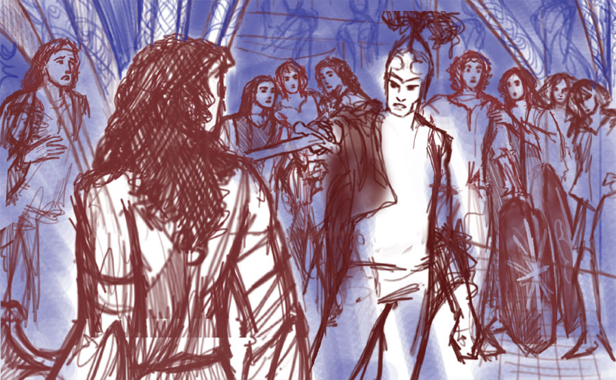
It was in early 1994 that I realised this scene was one tough cookie. Two Elves, one at an arm’s and a sword’s length from the other? That means a bit of Elf at the margins of a picture and rather a lot of nothing in the middle.  I realised that this was an iconic scene from the Silmarillion, but I abandoned the project after this quick sketch.

ot_drawing1

(Yes, I was under the impression that Fingolfin was blond.)

One and a half years later, I was doing my first ever watercolours, and I had found out that Fingolfin was dark-haired. I also found that a wider shot would solve part of the problem. I probably realised, theoretically, that foreshortening was called for, but this is 1995 we’re talking. No foreshortening in 1995, no, sir.

ot_drawing2

So, this year, I took on a commission of this precise scene and knew I would have to deal with foreshortening and some clever positioning.

In the first sketch, I still had to resort to a carefully draped cloak in order to cover up my foreshortcomings. Then I got some terrific help from the guys at comicforum.de, and managed to pull the pose off sufficiently for me to go with.

A progress shot from the lineart proper: Underneath, you see the sketch printed out in pale yellow, so I can filter it out later.

 wp_drawing-of-the-sword_2wi

Second progress shot.

drawing_lnwp2

Final version of the lineart (plus some parchment texture):

wp_drawing_ln2

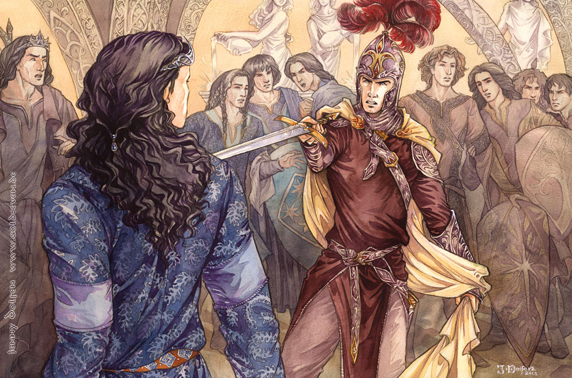
Left to right: Finwë, Fingolfin, Fingon, Turgon, Argon, Fëanor, Maedhros, Maglor, Celegorm, Curufin.

Now for the Painting of the Sword!

… or, how to avoid cluttering up mass scenes. On your second attempt.

In this painting, I have such an amount of detail in the lineart that I have to be careful not to kill the picture with it.Let me give you a fun example of how *not* to do it, from exactly ten years ago when I still signed my pictures with PJ: Messy goblin battle

Why is the colour job in that one such a train wreck? Because I didn’t know yet that the sharpest contrast of an image goes where you want the viewer’s eye to dwell. And only there. Contrast draws the eye. And light and dark contrast draws the eye most. Dark and light contrast across the whole of a picture draws the eye in a sort of crazy polka from which it will want to break as soon as possible and leave the dancefloor. Permanently.

There are loads of ways to avoid this; here is one that works really well with any medium, but requires a bit of planning beforehand. In fact, I had planned this even before I drew the lineart. In even more fact, this only worked to full satisfaction on the second attempt.

My first stage is nothing unusual if you know my workflow: An even layer of a single colour covering everything, to tie the eventual colour scheme together and avoid glaring white highlights that tear the finished image apart. I choose a mix between Yellow Ochre and Sepia with a bit of Cadmium Yellow.

While the paint is still wet (rule of thumb: wet enough to glisten on the paper, not so wet as to form puddles), I go in with a tissue and dab off the paint from the areas that’ll need to stand out later, like FĂ«anor’s and Fingolfin’s faces, and, most definitely, the sword.

Please note: Sometimes, the colours in the photos here are pretty far away from the actual ones, especially the later images. Too much distraction and not enough light for my silly old digicam.

tut_drawing2

This is the finished first layer with the faces dabbed lighter:

tut_drawing1

I want the statues to be lighter than the background, to look like alabaster (and discourage any go-go-girl connotations). Therefore, I paint the background behind everybody slightly darker, but still translucent.

tut_drawing2a

Now I’m going to make sure that all the detail in the background, while still being noticeable, will not distract too much from the foreground.

To that end, I mix a duller colour with more brown, and paint the background figures and arcs with a uniform layer that only leaves out the alabaster statues and the foreground figures.

tut_drawing4

So we’ll cleanly separate the different grounds – fore, middle, and back. I also add some handsome splashing to the bottom of my darker figure layer, which will stay even when all the rendering is done, to serve as “lost edges”. If you’re unfamiliar with the concept of lost edges, read what the great Mattias Snygg has to say about it.

tut_drawing5
Now, the detail is still there, and we have an image that is well readable and ready for the next stage – colour.

I then made a mistake. Th idea was to force myself to stay light in the background, so I went against watercolouring etiquette and started with the darkest part of the background figures – their hair. That way, I had something to check every other colour against – nothing must get darker than the hair. The idea was good, but the choice of material was not. I used liquid watercolours, as I have for months now – and they tend to cake up, and lose all of the lightness and transparency that a watercolour should have. And that’s what happened here.

tut_drawing9
After the stage above, I added a second layer of detailing to the background figures – which killed the piece. Beyond redemption. No matter how lightly you apply liquid watercolours, they always come out more opaque that watercolours from tubes or pans. With my latest pictures, that never bothered me enough to actually scrap a painting, but here, it was inevitable. The second background layer became too dark, killing the detail, clogging up the lineart, and making it almost impossible for me to get the foreground darker and still more detailed than the background.

Before I started painting Fingolfin’s tunic and hair below, I already realised the painting was lost. The foreground didn’t stand out against the background figures any more – they already were too dark.

Lesson learnt: play to the strengths of your materials. Use tubes where you want light and feathery colours. Use liquids where you want it dark and don’t mind opaqueness.

When you arrive at a stage where nothing will save your painting, you take it between two thumbs and forefingers and close your eyes, and only open them again after you’ve heard that RAAAAtttttsch! sound. Makes it easier. Good thing I still had the lineart.

tut_drawing_ratsch

I started anew and went back to this stage above. I used only watercolours from tubes this time, which really avoided that caked look.

This way, instead of doing the light background first and then forcing me to go ever darker in the thing that was more important in the painting, I started with the foreground – so FĂ«anor and Fingolfin would determine how light the background would have to be. A terminus post quem non, so to speak.

I started with Fingolfin’s tunic, with a wash of Ultramarine damped down by a touch of Indigo and Madder red, leaving lighter some edges to the right, where the light hits. I then mixed some Sepia with Indigo, Burnt Sienna and Madder and started on Fingolfin’s hair, still using only tube-paint.

tut_drawing10

The picture below shows the second, darker, detailing hair layer.

tut_drawing11

Then comes a part that’s both very laborious but still rather meditative. People are often amazed how I can have so much patience with patterns. Well, I could never understand why people paint Mandalas! But I suppose it’s much the same.

tut_drawing12

After the mandala, sorry, tunic-pattern painting. You’ll see I’ve also added some light skin tones (Burnt Sienna with Madder), and started detailing the beads in Fingolfin’s hair.

tut_drawing13

You’ll notice when painting around the patterns with darker colours I didn’t pay much attention to light and dark, leaving the tunic more flat-looking than in the first stage. So, more shadows are in order. For that, I now use some liquid watercolours, to make the colour more solid and dark. Rendering is easier with liquid watercolours, I find. I add quite a lot of purple to the mix, and start at Fingolfin’s right arm.

tut_drawing14

And this is what the finished tunic looks like:

tut_drawing15

I then mix in some darker brown and purple and give the hair the same darker treatment, adding depth and shadow with liquid watercolour:

tut_drawing16

Then, some detailing on the belt, with Sienna and Ultramarine.

tut_drawing19

Fingolfin is finished. Time to tackle FĂ«anor. The overall colour scheme will be blue for the Fingofinians, and red for FĂ«anoreans, so I start with an oxblood colour on FĂ«anor’s tunic, mixed from Madder red with some Indigo and Sepia. Tube paints, of course, for transparency.

tut_drawing17

I then mix much the same colour, plus some darker purple, for the shading – in liquid watercolours for rendering:

tut_drawing18

Some detail work that I tend to get lost in – hence, no in-progress shots for the metal parts and plumes on his helm. The paint dries so fast that I can work on the next layer almost immediately after painting the first, so I rarely take photos in between. All the colours below are again tube ones.

tut_drawing20

Some more work on this clothes. I’m undecided with the cloak at this point; I want to make it very light to have FĂ«anor stand out even more, but for that, I have to check back with the client, so I leave it for the time being. I just add some very delicate gouache to lighter bits on his greaves and other shiny details:

tut_drawing21

So the foreground figures are as finished as I can make them for the time being, and this is the overall result:

tut_drawing22

With just a hint of Bunt Sienna and Madder red (tubes, of course, for transparency), I then do the faces in the background, leaving out areas where the light hits. They won’t get a shadow layer at this point. Just a single colour/rendering layer. I can always get darker later if I think the pic can handle it, but I can’t get lighter, as I found out the hard way on the first attempt.

tut_drawing23

After the faces are painted, I use an extremely light (tube!) layer of Sepia for the hair. And some Burnt Sienna for Maedhros, and some unidentifiable mix for Celegorm, so everybody can pick out a hair colour for him and be happy…

tut_drawing24

Next, the sons.

I’ve just bought a very nice tube of Cobalt Turquoise, which is blue enough to qualify as “Fingolfinian” but still very different from what Fingolfin wears, and I use it gratuitously on Fingon, Turgon, and Argon, adding a hint of gold here and there to keep them from becoming too monochromatic.

tut_drawing25

The FĂ«anoreans get a similar treatment with Madder Red and Burnt Sienna, with a touch of purple and gold here and there. Mainly water on the brush, with just a spot of paint, avoiding the mistakes from the first attempt. And all tube paints, of course.

tut_drawing26

Next, I do the statues with a very dull mix of Sepia, Madder Red, and a touch of Ultramarine, only painting very light shadows.

tut_drawing27

tut_drawing28

Next, I splash around with rather a lot of purple tones on Finwë. Some redder, some bluer, to show how torn he is between the followings of his sons.

In the end, FĂ«anor is given a pale gold cloak, and some minor touchups to shadows and such follow… and we’re done! Please click for full view. :)

wp_drawing-of-the-sword_col

Ahem… and as I frequently do when a new year begins, I changed my signature. People keep telling me to include “Dolfen” somewhere; and I keep finding that my previous “Jenny+Year” was fine for pencil but difficult to do with brushes.

Detail shots:

wp_drawing_coldetail

So, I wish you all a Happy New Year! Drawing Runes this New Year’s Eve brought me Isa, Ice, the Rune of Stagnation. I suppose there can be worse things than stagnating on the level I’ve reached last year (brought to you by Inguz, Rune of Fertility, drawn a year ago). Better than the Rune of Bottomless Plummet or something.

Grand Old English Wash Brush or: Painting of Maglor

If you read my last post about art slumps, you already know that this piece gave me a lot of grief.

Part of the reason was that the colours insisted on caking up. Even the royal blue that comes out pretty transparent. On any kind of paper and with any kind of brush, I found I could not give the background the lightness it needed to have.

Then, on Monday, I found the solution to all my problems.

Now this, my dear friends, is an English Wash Brush. (Don’t say this with your mouth full.) The hairs (Russian squirrel) are so incredibly soft that you almost don’t feel them. It cost a fortune (thanks, mum, for helping me out there, you saved my life!) but it’s another of those cases where quality does come at a price, and is worth every cent.

Why this one is better than a synthetic brush? Even a sable brush? I wouldn’t have believed it, but this soft miracle adds a wash of paint while leaving the paper completely intact. Now when you paint, there’s always some amount of friction of brush on paper, resulting in a roughening of the paper. Rougher paper results in a caked look. The more water, the more layers, the poorer the paper quality, and the harder your brush, the more your paper will cake up and lose transparency.

No longer.

The colours I’ve used throughout this piece are: Royal Blue, Indigo, Cobalt Blue, Yellow Ocre, and Sepia, and a spot of Alizarin Crimson for the skin. I’m working with liquid watercolours (Rohrer/Klingner, Docmartin’s, and home-made ones. Nobody stocks any Indigo or Sepia.)

Note – the colours in the photos come out WAY off. There’s a definite green-yellow tinge even under my daylight lamp, sigh. In Latin, you call this way of working lucubrare – working in artificial light. That’s the curse of a working mum artist. ;)

First, I put my new brush to good use and went about painting the same background a seventh time. I used a light Royal Blue wash with a touch of Cobalt and Indigo, dabbing off the paint with  tissue while it was still wet where the crest of the wave would go.

My goal was to give the entire image a blue, cool, otherworldly tint. This piece is a sort of companion piece to “It ends in flame“, so where the other one is fiery red, this one will be cool blue.

I then used some masking fluid to preserve the whites of the gulls and the crest of the wave. You may remember my previous trouble with masking fluid; I’ve avoided that by mixing the fluid with water. This way, it usually comes off fine.

The masking fluid I now have is tinted blue. Very convenient, as the clear/white fluid is often really hard to see.

I wait for the fluid to try – this takes about half an hour – and paint the darker portions of the sky.

The wash I use for the darker sky portions is made up by Indigo and Royal Blue. To set off the sea later, I’ll use more Cobalt and Royal Blue and less Indigo. My first attempts at this were rather monochromatic but they didn’t cut the mustard. They can still be found in the bin.

I dab off paint again for the clouds.

While I wait for the sky to dry so I can rub the masking fluid off, I paint the  rocks with a bluish wash as well. That way, the rocks will later fit into the overall blue colour scheme though they will have some yellow in them.

I use a large brush and paint mostly into the corners and edges that will be in shadow later.

When everything is dry, I rub off the masking fluid.

Next, I paint the  sea. As stated above, I use Cobalt and Royal Blue, and paint around jagged bits that’ll create the illusion of waves. I make the smaller further back and bigger towards the front.

I then paint the insides of the rising waves with a darker blue containing Indigo and Cobalt. I use the same techniques as in my “Schimmelreiter” picture I painted two years ago, drawing up rising shapes of shadow and leaving lighter circles inside them to indicate foam.

Now it’s time to add some more colour. I mix Yellow Ocre with rather a lot of all my blues as well as Sepia to tone it down, keeping the different drops of paint in separate portions of my palette so the wash turns out slightly different with every brush stroke. I use more yellow in the portions to the right of the rocks. I don’t do any detail work yet.

Of course, the rocks in the background get the same hue, only with more blue to indicate that they’re further away.

I then painted Maglor’s coat. I stuck to the same basic hues I already had in the background, to make Maglor blend in with his surroundings and make him meld into them, as if he wasn’t really there any more and was becoming part of the seascape. Here, I mixed Cobalt with a touch of Yellow Ochre to gave the coat a more greenish tint.

For the ornaments and boots, I used pretty much the same tone as for the rocks.

I left Maglor for the time being and turned to the rocks again. First because they’d dried by then and second, because in the past, I’ve frequently become caught up in one portion of the pic, rendering it to death before I really came to my senses and got a good look at the overall thing again. It worked for most of those pieces, but here, I needed a rougher, more dreamy feel.

As I found out with all the ivy in “Ossiriand“, the only way to suggest detail is… to actually paint it. For this, I googled for barnacles to see how they were structured. In the lineart, I had already suggested barnacles in some portions of the rocks but not in others, to create lines through the pic and lead the viewer up to Maglor. I painted the shadows around the barnacles darkest in those places. I gradually added three darker washes in the shadows, getting smaller and more detailed with each one, while leaving large portions of the rocks un-barnacled. Just some squiggly lines so they don’t look bland and smooth.

There. Barnacled glory!

I grew up on the North Sea, so for seascapes, I can always draw on a good amount of experience mixed with memories and emotion (and smell). I had the smell of barnacles in my nose all night.

Okay, this is where the smell of vodka drowned out the smell of barnacles. I painted Maglor’s cloak with a mix of Indigo and Cobalt, with some Ochre thrown in to dirty it. The vodka was to make his clothes look faded and old. (And this is why you should always stay away from vodka, kids.)

Some faded texture on Maglor’s coat. I wanted this double effect of clothing that looks at the same time richly ornamented and old and worn.

Credit for the beautiful pattern on the coat goes to Marco SchĂĽller and a painting he did of Columbus, who had a coat in the same pattern. I threatened that I’d send my Elven ninjas to steal the cloth from him. They’re as good as their word. Well, maybe not quite. His looked better.

I then added shading to the ornamental borders on Maglor’s clothes, doing squiggly stuff again. Squiggly stuff is wonderfully versatile. It can suggest barnacles or knotwork depending on the amount, size, and shape of squiggling.

The skin, by the way, was painted with a mix that doesn’t look like skin at all – Alizarin Crimson, Sepia, Cobalt Blue, and some Yellow Ochre. An actual “skin tone” would have looked horrendous here.

The hair was mostly done in Sepia, and needed next to no detail work, as most of that had been done in the lineart.

More darker Indigo for the cloak. And more vodka.

Plus some detailing down the sides of Maglor’s legs to indicate a seam.

The finished image, in its actual colours.

Detail shots (click to enlarge):

Ancalagon – painting

I’m pretty happy with how Ancalagon turned out here. Here’s how I did him:

For his look, I browsed the web for good closeups of… lizards. There’s an awful lot of great lizards out there – horned lizard, dragon lizard, and armadillo lizard were just a few I looked at in order to make the scales look good. The scales were really my main aim with this one. Lizard (and dragon) scales are really tiny in areas where mobility is needed (like the shoulder), and larger where they have to protect. Together, that made for a great irregular and interesting look. The wings were inspired by Pterosaurs.

Here are the painting steps:

First, a sickly yellow wash for a sickly light in the background. I used a mix of bright yellows, Sepia and a bit of blue for that. This reduced one compartment of my water box to a very sickly yellow brew, which will come in handy later on.

Darkening the wash in places, and working out a brighter portion of sky to his left.

With Sepia, Alizarin Crimson and Ultramarine Blue, I created a purplish base colour for Ancalagon. The mix was still far too clean. So what I did was to use it together with my dirty yellow water; more in some places,  less in others. The mix of complementary colours – yellow and purple – made for some very natural-looking subtle hue variation in the overall dragon body.

Then I started to detail his face, adding a first darker layer of paint. I left standing some of the lighter purple layer underneath, and was careful not to paint the scales too uniformly. Leaving a white edge on all of them in the same place would have become pillow shading.

Again, some hue variation for more vividness in the colours. In my palette, I had my purple paint next to a more brownish blob of paint, and I frequently dipped the brush into the more brownish too.

Painting around the veins in his wings. To make them stand out less, I later put another, darker glaze on top of the wings – the liquid watercolours leave very pronounced edges standing if you go over them again with another glaze, which I used to my advantage here.

A third, even darker, layer for the face and other selected areas of scales.

On the “arm” (in the wing), I left some highlights standing to suggest muscles.

There will be blood – painting

Run, little Orcses, run.

I’m proud to announce that I have found the paper/paint combo that I will stick with to the end of days. Doc Martin’s liquid watercolours – no surprises there – and Canson Montval. The Canson students’ paper is good, but tends to cake up under too many layers of paint, and dries too fast. Enter Canson Montval. Handles like my beloved HahnemĂĽhle BUT allows you to go really dark in the shadows without caking up. Auta i lĂłmĂ«!

Ahem.

I documented the painting steps for this one, and instead of giving them all chronologically, I put them together sorted by face/hair/metal, which made a lot more sense here.

Colours used: Permanent Red; Indian Red; Alizarin Crimson; Yellow Ochre; Cobalt Blue; Payne’s Grey; Burnt Umber; Burnt Sienna. All very much mixed beyond recognition.

The colour used for the face here was dulled rather a lot by some Payne’s Grey. It’s hardly noticeable here, and that is good – if I hadn’t done it, he would have stood out against the dull greys everywhere. The shadows have got great amounts of Alizarin Crimson and blue tones.

The hair was done in my usual way: Laying down a base glaze of reddish paint (again with rather a lot of cold blues added), with more water used in spots where the light hits. Then, after drying, the second glaze, picking out the darker strands.

For the armour texture and reflections, I got one of my dearest reference books off my shelf: “Söldnerleben im Mittelalter” (The Medieval Soldier), by Gerry Embleton and – John Howe. With John Howe actually posing in fifteenth century armour.

The key to doing believable metal in any medium is a mix of sharp edges and high contrast. I can’t say I’m that good at it, but I do my best.

Edit: Several people pointed out that the red of his tabard should reflect on the armour; so I added a bit of that in the finished version. You’re right, of course.

Some detail shots:

Ossiriand – painting

I finally found the time to paint “Ossiriand”.

The result surprised me, quite frankly. I chose Dr Martin’s Liquid Watercolours and Canson paper to work on, as I wanted this pic bright – turns out that the result was almost too bright. Hence, I turned down the saturation a little in the final painting (as well as adding a slight yellow overall tint); that’s why the in-progress shots don’t fit colour-wise. (It’s also because my camera was completely overtaxed with so many colours; especially towards the end, I haven’t been able to fix them in the wip shots completely. The original is not as far away from the above version as most of the photos below.)

I can’t believe I’ve been struggling with brighter colours for years. The combination of the good ol’ Dockers with Canson is certainly an assault on the rod cells!

The first stage was to put a yellow wash over the entire pic, to achieve a golden sunlight glow in the end. I made it less pronounced where the sky would later go, so as not to end up with a green sky.

After this layer had dried, I put down the blue for sky and rivers…

… and mixed some rather pale green for the greenery in the back.

You see my putting down quite a lot of wet-into-wet paint there, for vegetation look that’s not too detailed.

Background greens added:

Now for the leaves in the foreground, I used a somewhat more detailed approach. I’ve often tried, over the years, to achieve mind-blowingly detailed greenery by wishy-washy-wet-over-wet stuff. Needless to say, I never found the magic formula. The only way to do detailed greenery is with small brushes and painted details. I already laid some of that down in the lineart.

Now I start painting the foreground leaves – detailing a few select leaves by highlighting the veins (painting around them), using a rather yellow green tone so they’d really catch the sunlight later.

Then I painted the rest of the leaves in the same green tone.

Then I go in with a second, more bluish green tone, painting over some of the blocked in light green leaves, again leaving out the veins. Some others I completely paint dark, others I leave light green.

So with these two tones, I paint four kinds of leaves: the light ones with “white” veins you saw above, dark green with light green veins, light green without veins, dark green without veins. This makes for a lot of very lively variation with pretty little effort.

For some more realistic lighting, I paint in some darks with a touch of red – now the leaves really pop.

I then begin to fear that the reddish foreground will completely upset the colour unity, and lay down a stronger yellow foundation.

The first layer of horse coat (and Maedhros’ hair). I should add that what Doc Martin calls Burnt Sienna isn’t Burnt Sienna at all. I had to do quite a lot of mixing before I got the tone right.

For the second layer of horse coat, I added some more reddish-brown hues, but rather close to the first.

At which point my camera just quits and picks up all sorts of hues.Note how, in the pic above, the horse looks rather out of place. This will be remedied in the shadows.

For the shadows, I mix in lots of blue, to reflect the colour of the grass in the shadowy areas. This ties the horse to the surroundings.

Then I go and paint Maedhros’ clothes and all the little details – not much to say here that I haven’t said several times before when outlining how I shade. :)

Except this one – his boots. I relay liked the details here.

As always, hope it was helpful – enjoy the final result! ^___^

All the others, gone

A missing moment that I hadn’t even seen until now – we all know that Finarfin came briefly to Beleriand to lead the Noldor of Valinor into battle against Morgoth in the War of Wrath.

Has it ever occurred to anyone how painful it must have been to finally be reunited with his daughter – and learn that his four sons, his granddaughter, his brothers, all his nephews and niece were dead, dead in that land for which they had set out six hundred years before, full of hope of glory and freedom…

Image

Galadriel looks rather younger and more vulnerable here than I usually see her – even in the rebellion of the Noldor six hundred years previously – but then, this whole concept of parents in their mid-thousands and their children in their early thousands is hard to grasp for us mortals…

Lineart:

Finished:

And I went ahead and made a coffee painting tutorial. Mostly because I really haven’t found any online that went past “Make coffee. Paint picture”. There are so many interesting things going on with coffee that it was really worth it explaining them.

Coffee texture from: http://fav.me/d3edyhg Coffee beans are a free stock image.

It ends in flame – progress

That other picture I had lying is taking shape: The final moment of Maedhros.

First, as this seems to have become the thing to do, I’ll share the 1995 version. Yes, I was prolific in 1995.

Note Maedhros’ clothes. I can only surmise that this is what I understood by “they disguised themselves” – he took off his mint-green tights!

So, the 2012 version was to become… slightly more dramatic.

I started with a digital scribble (and another self-photoshoot which I won’t share this time because *I* was wearing rather unflattering tights – not mint green, but still):

Initially, I had it vertical, but was quickly convinced that horizontal showed all the scope of tragedy. I also decided I didn’t want to show his face but convey all the impact by the fiery surroundings and his pose.

I then hunted for inspiration for the linework, and found it in the works of Arthur Rackham.

I’m going to attempt a rather light colouring for this one – possibly with coffee. I saw that used today again in katarina-san‘s gallery and the way it stains looks so incredibly cool. (If you don’t know her stuff, you absolutely have to go see it!)

Painting with coffee was a BLAST. It shouldn’t be allowed to have so much fun with such a terrible scene.  I didn’t manage to document all stages for this one – too busy experimenting and tweaking. But I’ve got more up – a full coffee tutorial over the next few days. ^^

The finished image. Click to enlarge!

The Oath of FĂ«anor – painting steps

As always, my lineart is drawn in pencil on Bristol board, scanned, and printed out on watercolour paper. (For any questions on that process, see my FAQ above!)

This one proved to be the toughest watercolour I’ve ever done.  I actually did a watercolour thumbnail before painting, trying to work out how much paint to put where. I still started over more often than I’ve ever done with any pic of mine, but I wanted this to be as close to perfect as I could make it, and the background was a beast to work with, because of the flame effect I wanted to achieve.

I went through several attempts with different paints or paper – gouache proved too blotchy and not bright enough, while Arches paper yielded great results for bright fire but then refused to get any darker than pale purple for the figures – and returned finally to my trusty old Schmincke watercolours and HahnemĂĽhle Veneto Torchon paper.

To get there, the first stage was a bright Cadmium Yellow wash over the entire pic, mostly in a horizontal strip where their faces are. And it couldn’t be yellow enough. I found that out the hard way again with one or two earlier attempts; the second red wash swallows all the yellow.

Note: The next three images were not taken of the “final” painting, but of one discarded in between because the lineart was wonky in places. That’s why there’s a slight break between “tut_oath3” and “tut_oath4”.

Then, when the yellow was almost dry, I mixed Madder Red with some Burnt Sienna for the red wash. I use Madder because of its glazing qualities. It dries almost transparent even if applied rather thick. And I needed thick here. No pink this time, please.

I started at the bottom and drew up the red in layers; making it almost pure water in my yellow strip and then getting redder again towards the top.

Now came the trickiest part. I wanted the red to stream up in fiery streaks – blurry around the edges, but not too wet. So I had to get them in at exactly the right time, when the paint was still moist, but not wet. (When you take off very wet paint, it just flows back in, only thinner and paler).

I used a dry, thick (size 12) sable mix brush to take off the paint in the shape of flames leaping up towards FĂ«anor.

I then went in again and painted more deep reds into the spaces, to augment the effect and counteract the thinning of colour you always get when you take off paint.

So I’ve arrived at this.

I let this stage dry completely and then apply a dark wash that represents the dark sky. My previous approaches had lots of Indigo in it, which resulted in a rather clogged-up feel – Indigo is as opaque as watercolour gets. So this time, I opted for Ultramarine, Madder Red, and some Burnt Sienna to dull down the blue – the result was rather close to Indigo but much more transparent.

Applying that wash was tricky, as I had to paint around the swords and arms. (Did I mention that masking fluid hates me and does not cooperate no matter what?) So I have some wonky bits especially on Curufin’s sword, but I’ll sort those out with the highlights.

Having to paint around small details never makes for a particularly smooth look, but it was okay here. I made sure to have any irregularities running in the same direction as my flame-lines, and that worked pretty well.

So, the background is finished – on to the foreground work.

I start by putting a lilac wash over all the foreground figures, so assure that the underlying colour scheme in the foreground will be both consistent and shadowy. I leave some areas unshaded where the light hits.

After doing this for the whole foreground, we’re left with this.

Next, I tried how much more colour diversity the foreground could take. It *needed* to take some Burnt Sienna for Maedhros’ hair.

Yup. Let’s go ahead and paint clothes.

This still isn’t the full colouring job – the four figures on the left are still missing, and I’ll be adding another darker wash to the clothes later, too.

You see me working from right to left. This is a smart thing to do if you’re left-handed.

Not a smart thing to do whether you’re right-handed or left-handed are wide sleeves. At least not while you paint.

These are the sort of things that make you want to thank God for Photoshop.

So, barring accidents, or glowering at unshaven Curufins if accidents did indeed happen, the nearly-final image is this.

The last thing that needs to be done is something I’ve never actually done before – adding gouache to a finished watercolour painting for highlights. But hey, there’s a first time for everything.

I mixed white gouache with yellow and just a hint of red and set to work. My gouache palettes, incidentally, are the lids of Chipsletten crisps.

I paint in highlights with a very thin brush – a 0/5, which was barely thin enough – and I’m done!

Click to enlarge, please. :)